SUPPLYSHIFT
Consultant | Designer | Developer

SupplyShift is a powerful platform that helps businesses tap into critical supplier insights and optimize their bottom line. As a creative consultant, I provide responsive web development, UX/UI design, and WordPress PHP expertise—ensuring SupplyShift’s digital experience remains both user-friendly and cutting-edge.
CASE STUDY: LOGO DESIGN
Establishing a Fresh Look for SupplyShift Essentials
Overview
SupplyShift needed a new logo for their latest product, SupplyShift Essentials—something that would move the brand forward without deviating from its core identity. Beyond designing the logo itself, I showcased concepts illustrating how this new branding could effectively extend across print, web, and mobile. This holistic approach demonstrated the value of consistent design and laid the groundwork for future branding projects.
Objectives
While SupplyShift was initially open to completely redesigning their emblem, I recommended against it to maintain brand cohesiveness and avoid confusion.
Deliverables
From user interviews and early concept brainstorming to final design execution, I developed a logo that seamlessly fit within the existing SupplyShift aesthetic—without requiring a full emblem redesign. This solution preserved brand recognition while giving SupplyShift Essentials a distinctive, forward-facing identity.
The final, approved transparent logo for SupplyShift Essentials strikes the perfect balance between simplicity, functionality, and brand alignment—offering a clean, modern mark that seamlessly fits into SupplyShift’s evolving product line.
Throughout the concepting process, I created multiple design variations and iterated on SupplyShift’s emblem at their request. Later, I offered strategic guidance on best practices, ensuring we struck the right balance between brand continuity and fresh, impactful design.
Here are a few initial concepts that didn’t make it to final approval. While they explored emblem redesigns, they didn’t align with SupplyShift’s existing brand identity, highlighting the importance of cohesive design choices.
CASE STUDY: LIBRARY DEVELOPMENT
Creating a User-Friendly Partner Directory for SupplyShift
Overview
SupplyShift needed a central library to showcase partner information in a clean, intuitive way. The challenge was to organize content by partner so users could quickly find what they needed—like how the Sustainable Coffee Challenge sections present two distinct coffee offerings.
Objectives
- Build an easy-to-understand UI, divided neatly by partner.
- Ensure content remains cohesive and on-brand for SupplyShift.
Deliverables
After several rounds of refinements, I delivered a responsive layout aligned with SupplyShift’s branding, goals, and desired user experience. Each partner’s offerings are neatly grouped, making it effortless for users to navigate and explore.
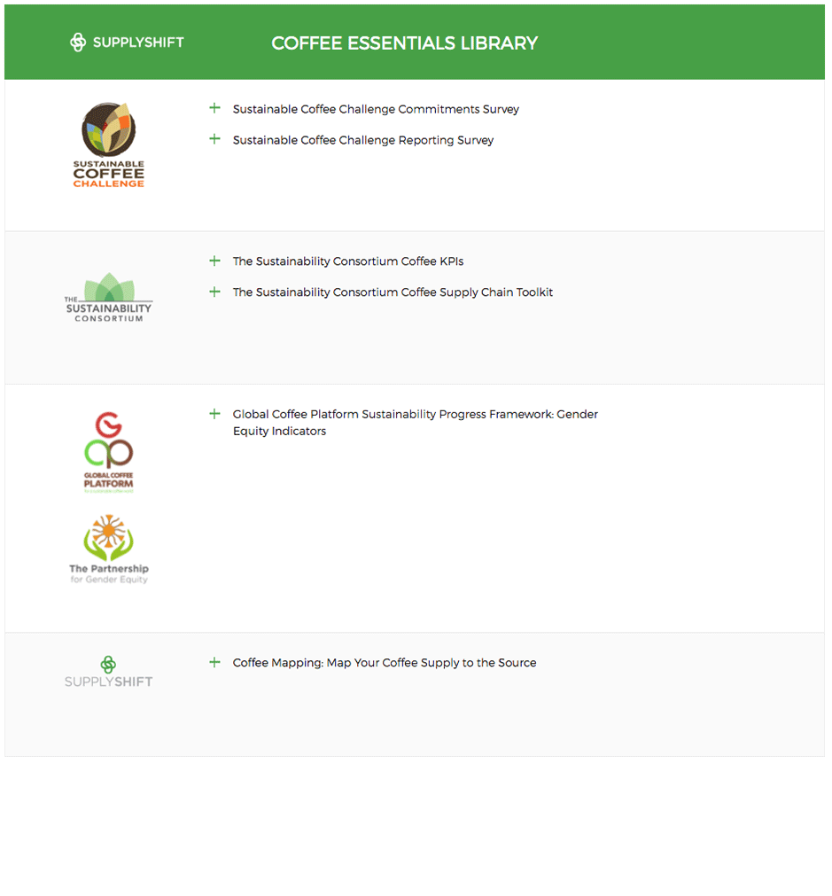
The library’s user experience was built using PHP, allowing WordPress to seamlessly handle new library sections, logos, and content. For added flexibility, we used JavaScript to automatically apply a #fafafa background value to every newly created section—keeping the look clean and consistent as the library expands.
CASE STUDY: BANNER DESIGN
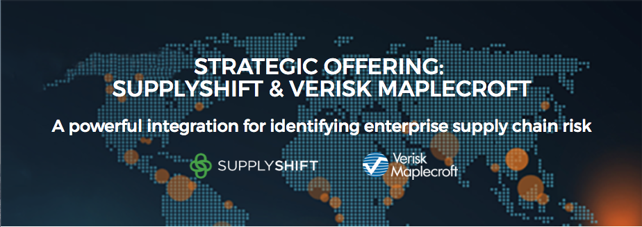
Showcasing the Verisk Maplecroft and SupplyShift Partnership
Overview
SupplyShift needed a visually compelling banner to highlight its partnership with Verisk Maplecroft. They provided preliminary concepts, but ensuring stakeholder alignment on user interactions was crucial for a seamless final design.
Objectives
- Transform initial concepts into a banner that clearly communicates the partnership’s value.
- Align stakeholders on key user interactions, ensuring a smooth and engaging user experience.
Deliverables
During our discovery phase, I pinpointed critical interaction points and integrated them into the banner’s design. By sharing these insights with SupplyShift, they could ask more informed questions, prioritize essential tasks, and hit their overarching goals for the project.
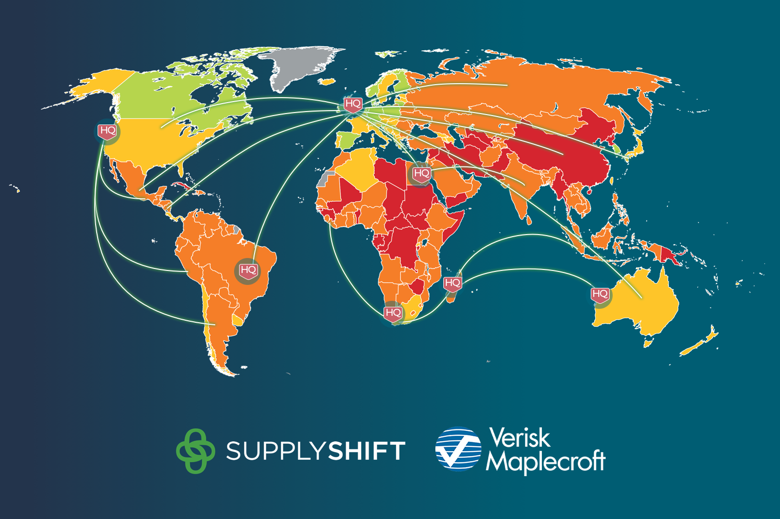
I collaborated closely with SupplyShift to grasp the nuances of their alliance with Verisk Maplecroft and to capture the core narratives behind it. Drawing on these insights, I crafted banner scenarios that seamlessly matched both companies’ visual styles and conveyed their shared story.
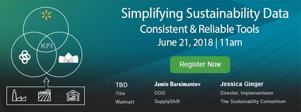
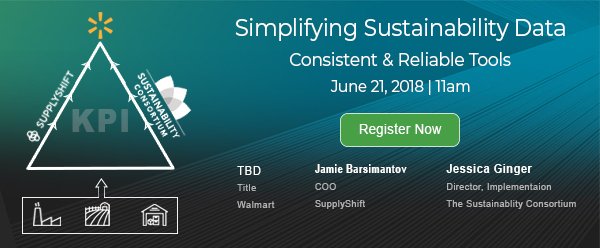
CASE STUDY: WEBINAR REGISTRATION DESIGN
Empowering Brands with Streamlined Supplier Data
Overview
SupplyShift was preparing a webinar to demonstrate how they help brands simplify supplier data collection through automated KPI dashboards—spanning numerous product categories.
Objectives
- Create an eye-catching ad or infographic that clearly conveys the webinar’s focus.
- Give users a quick, visual snapshot of the meeting’s key topics.
Deliverables
Following discovery, initial designs, and final reviews, I crafted a contemporary layout highlighting various software providers that support multi-tier reporting across consumer goods value chains. The visual storytelling effectively illustrated how SupplyShift’s approach unites different stakeholders under a single, efficient data ecosystem.
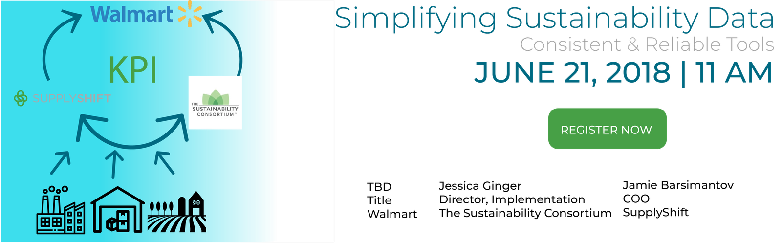
We held a series of collaborative sessions where requirements were hashed out in real time. Using open discussions and whiteboarding, we shaped initial concepts into actionable ideas that guided the final design strategy.
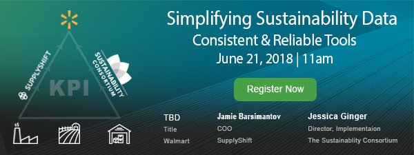
Following our discovery phase and multiple revision cycles with key stakeholders, I shared several conceptual directions during our initial design review—ensuring every voice was heard and each idea was explored.
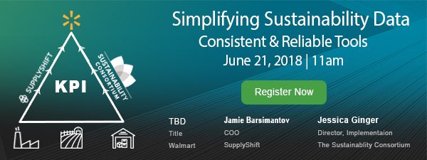
Here’s the final approved design that SupplyShift rolled out, seamlessly aligning with their brand while clearly conveying the webinar’s key message and value.