Case study · 2019–2025

Kaiser Permanente

Enterprise UX at 70,000-person scale

I helped modernize Kaiser Permanente’s internal ServiceNow experience—turning a fragmented portal into a clearer, accessible system for more than 70,000 employees.
Design leadershipServiceNowDesign systemsAccessibilityFront-end
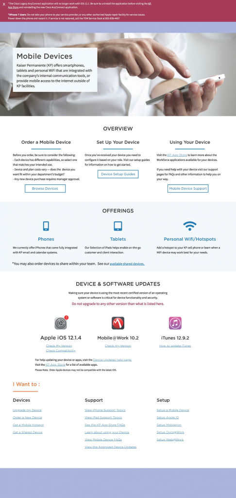
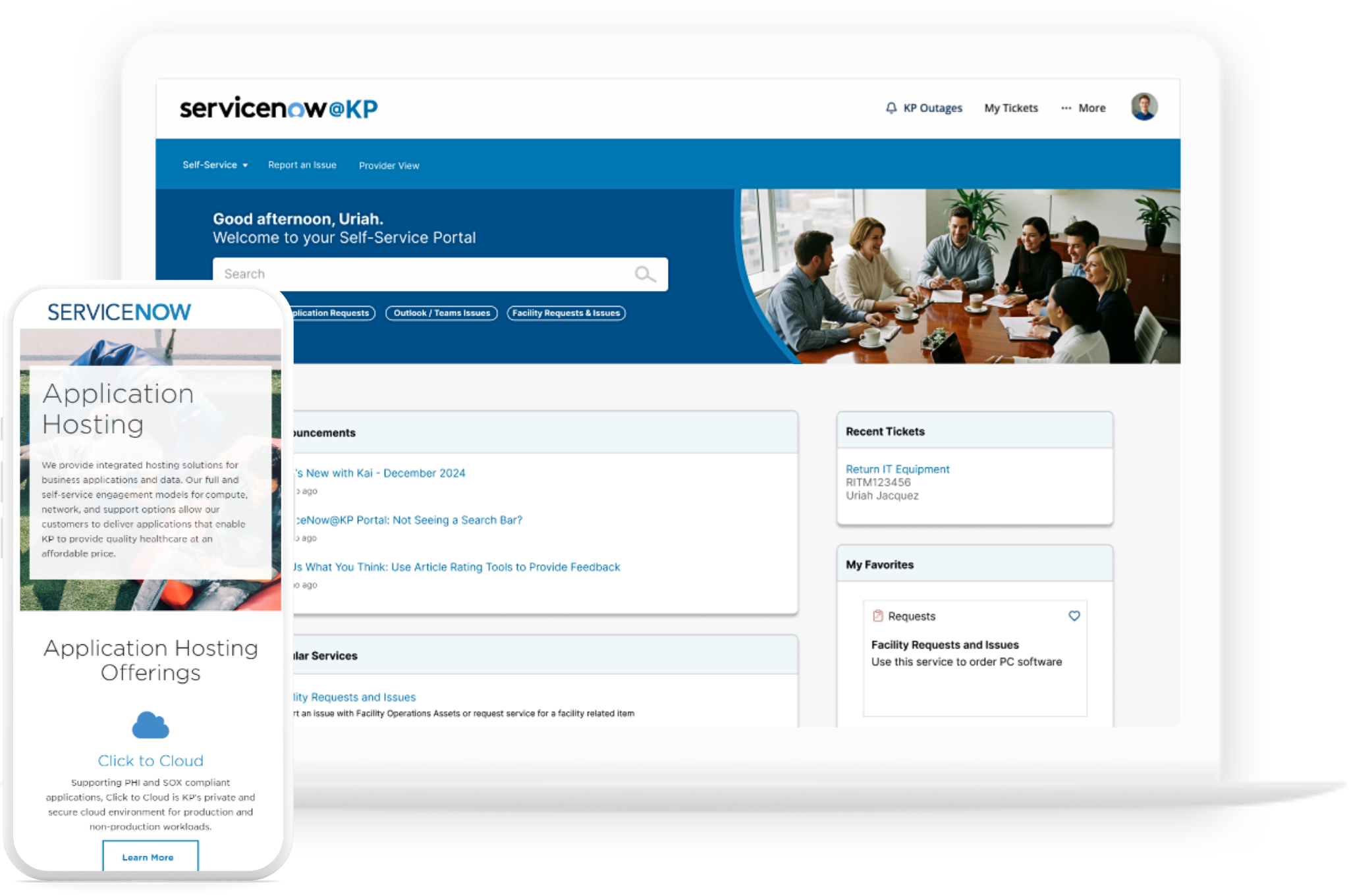
Kaiser Permanente ServiceNow portal redesign screens
Scale70,000+ employees
Team2–3 designers · 2 developers · 1 PM
ConstraintsServiceNow · HIPAA · accessibility
ToolsFigma · Miro · Adobe · HTML/CSS · ServiceNow
01 / Challenge

Making the complex understandable.

Kaiser’s employees depended on a dense service portal constrained by ServiceNow, HIPAA requirements, legacy patterns, and years of accumulated design debt. The work began with a WordPress-to-ServiceNow migration, then expanded into a multi-year product and design-system transformation.

02 / What I led

Direction with hands-on depth.

I set UX direction, mapped journeys and information architecture, facilitated cross-functional decisions, designed reusable patterns in Figma, built custom AngularJS/HTML/CSS interfaces, and partnered with product managers and developers through handoff and release.

03 / The system

Designed to work beyond one screen.

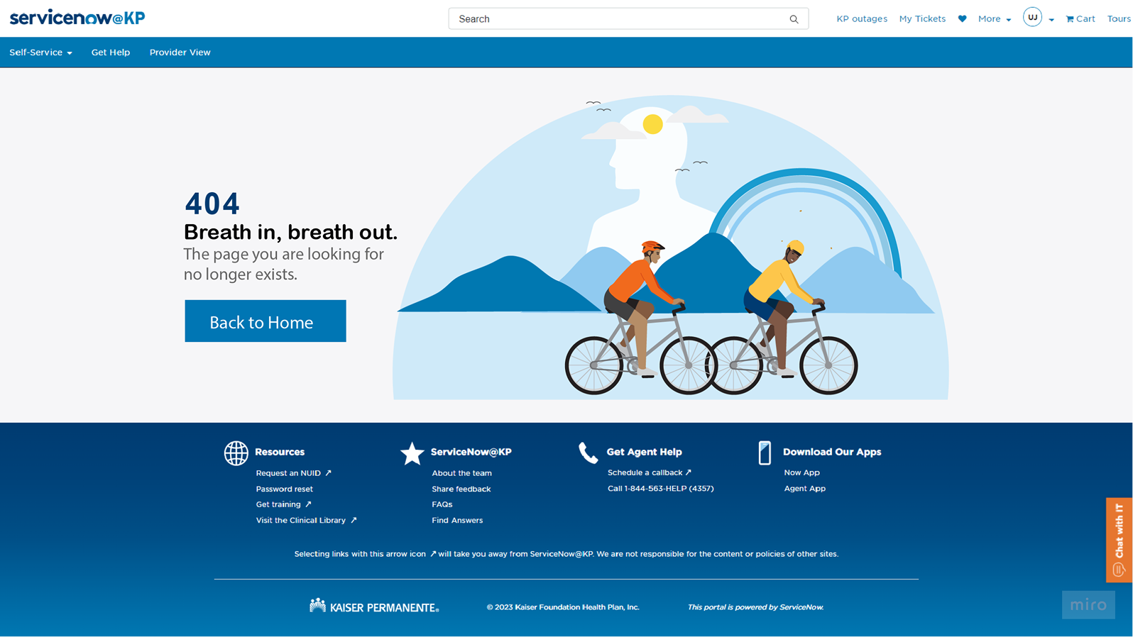
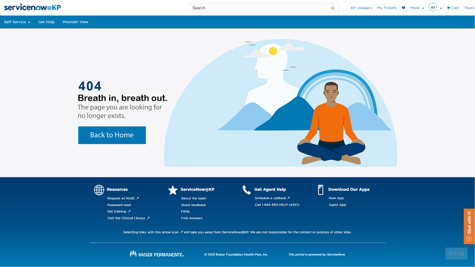
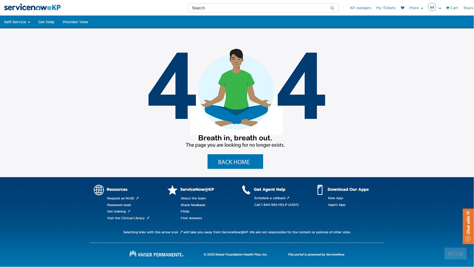
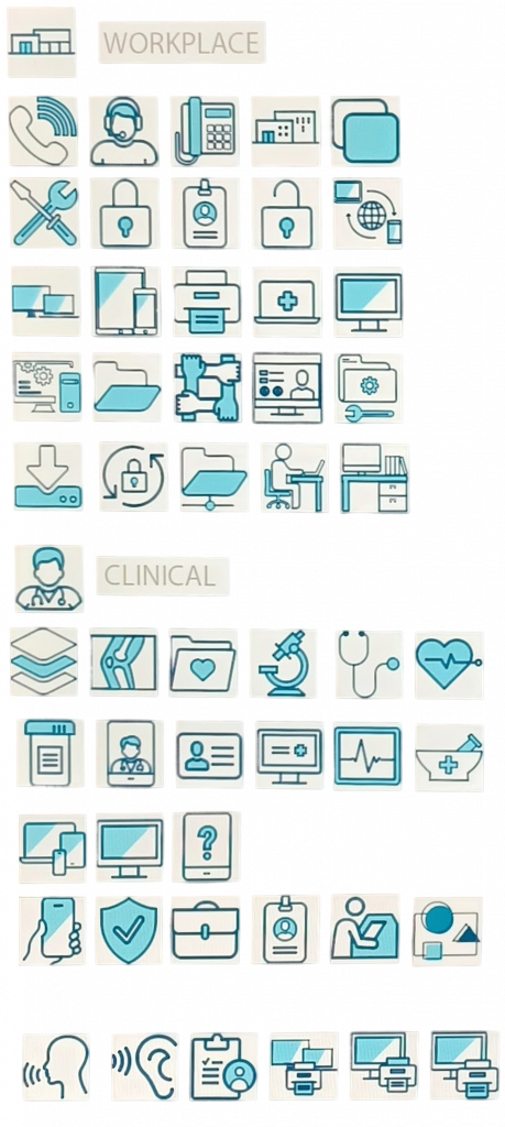
The program evolved from foundational migration work into Redesign 2.0: a modular, tokenized design system; responsive service experiences; a custom icon library; clearer navigation and request flows; accessible error states; and a conversational support experience aligned to the larger platform.

04 / Outcomes

Evidence that the work moved things forward.

  • 60% reduction in support tickets reported after the redesign
  • 40% improvement in design and development efficiency
  • 15% increase in employee satisfaction
  • A scalable system that reduced design debt and aligned distributed teams
05 / Selected artifacts

From thinking
to shipped work.

Process, systems, and final executions from the original case study.
Current-state employee journey
01Mapping the current-state employee journey
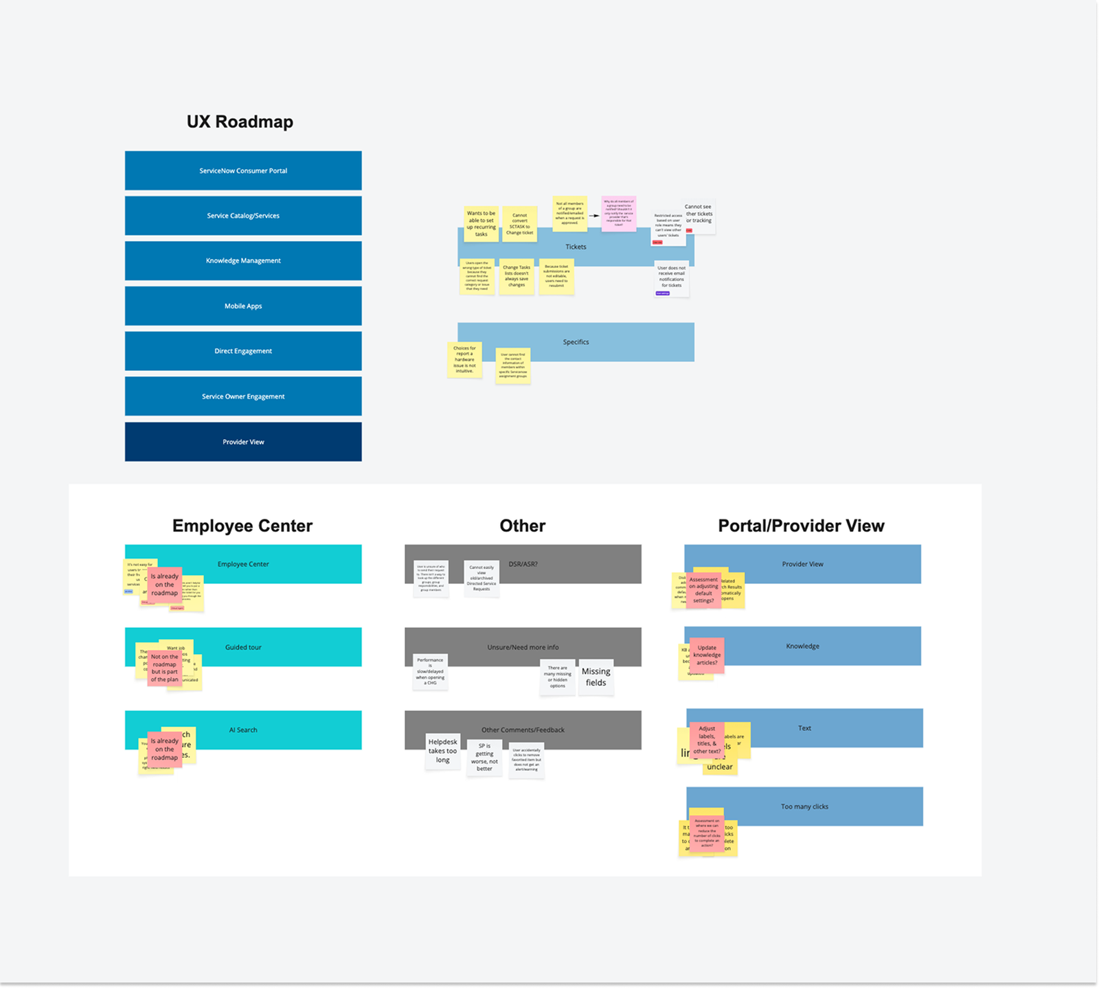
Enterprise UX roadmap
02A practical roadmap for staged improvement
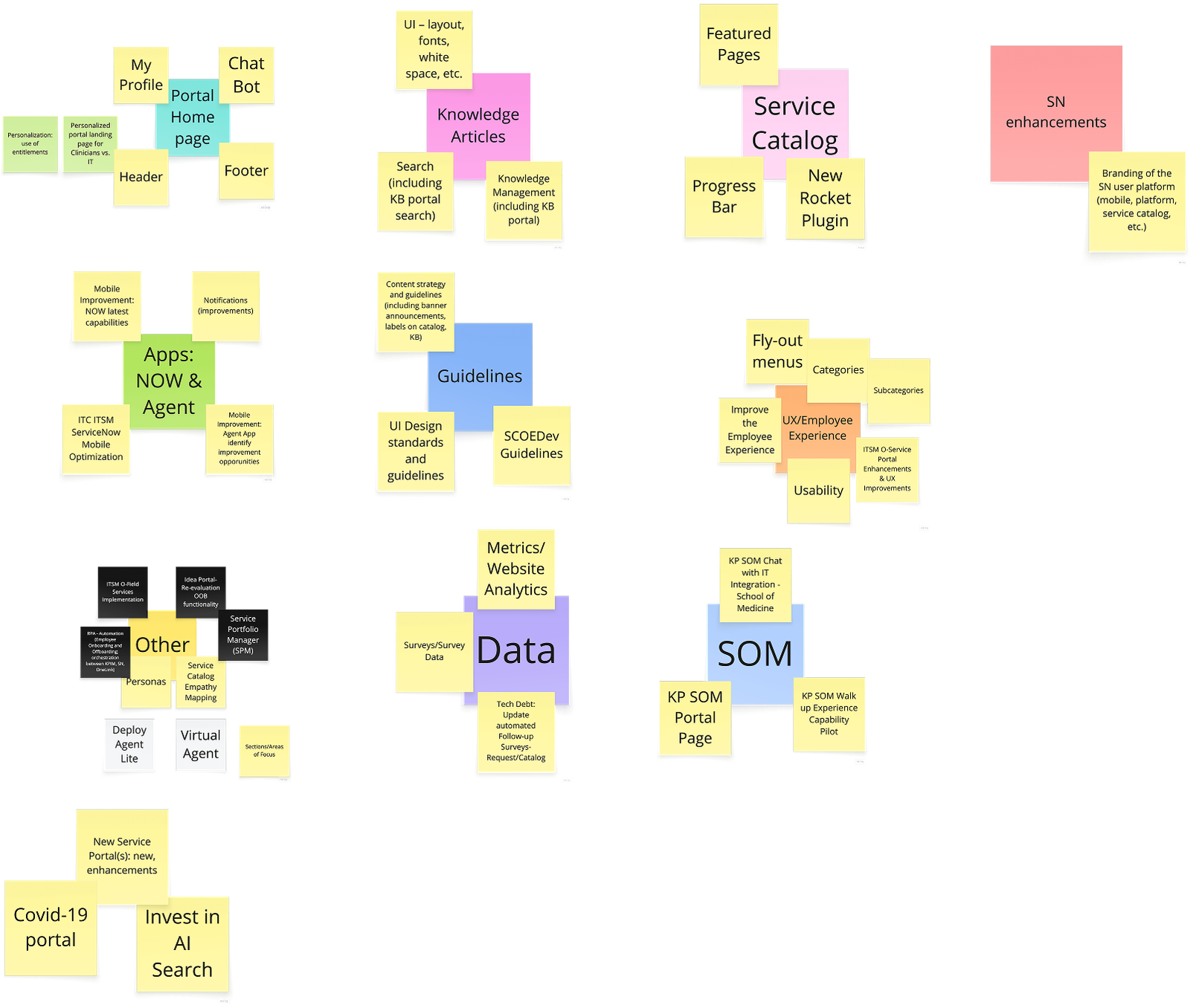
Workshop affinity map
03Synthesizing needs, constraints, and opportunities
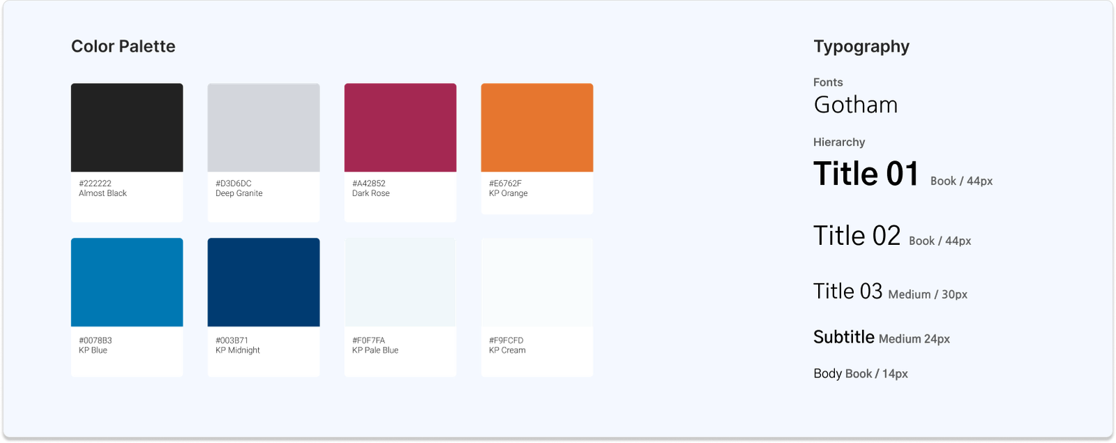
Kaiser design system overview
04A shared visual and interaction foundation
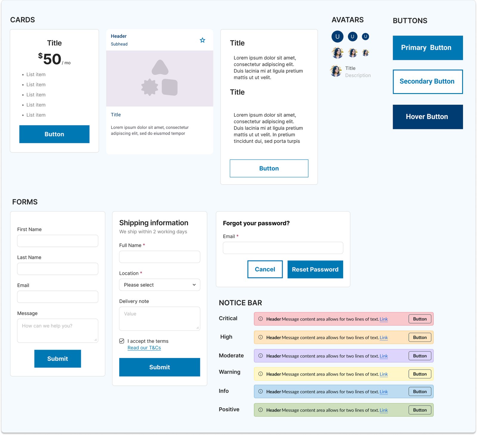
Reusable interface components
05Reusable components designed for scale
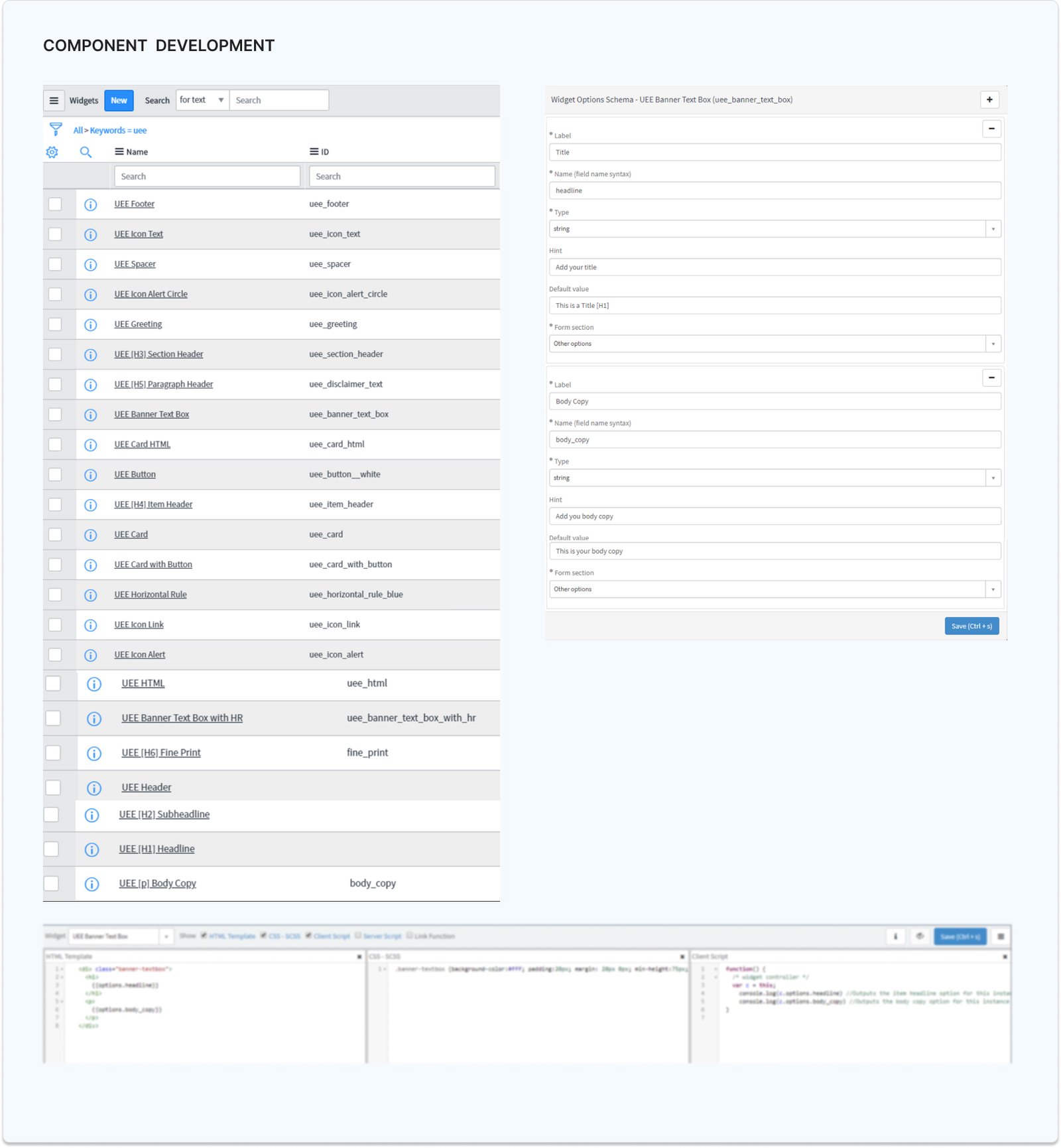
Component development workflow
06Connecting design decisions to implementation
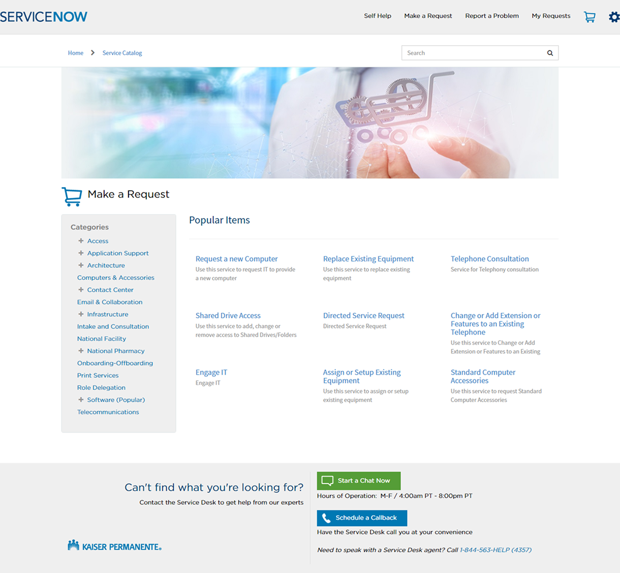
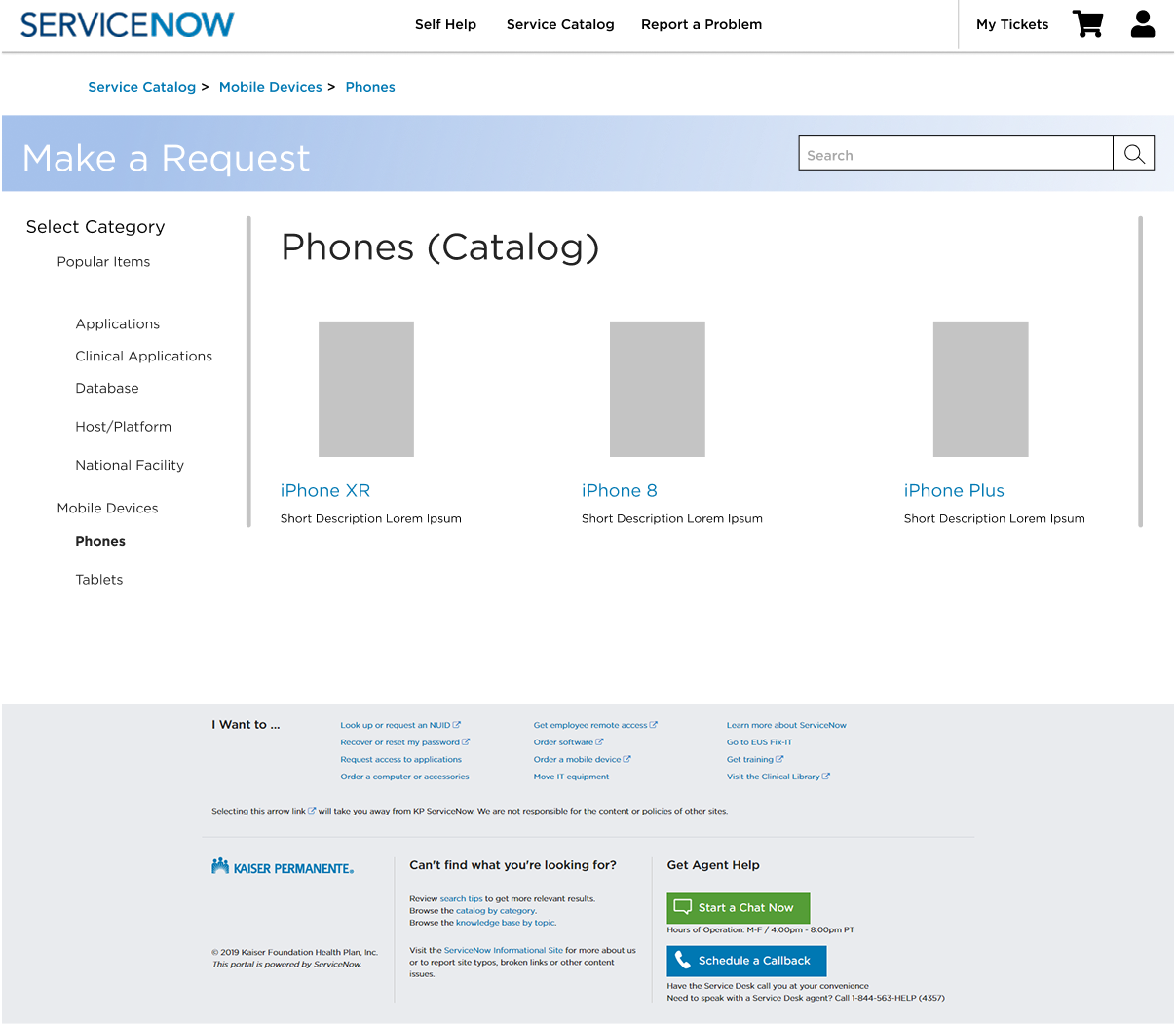
Make a Request experience
07Making high-frequency employee tasks easier to find
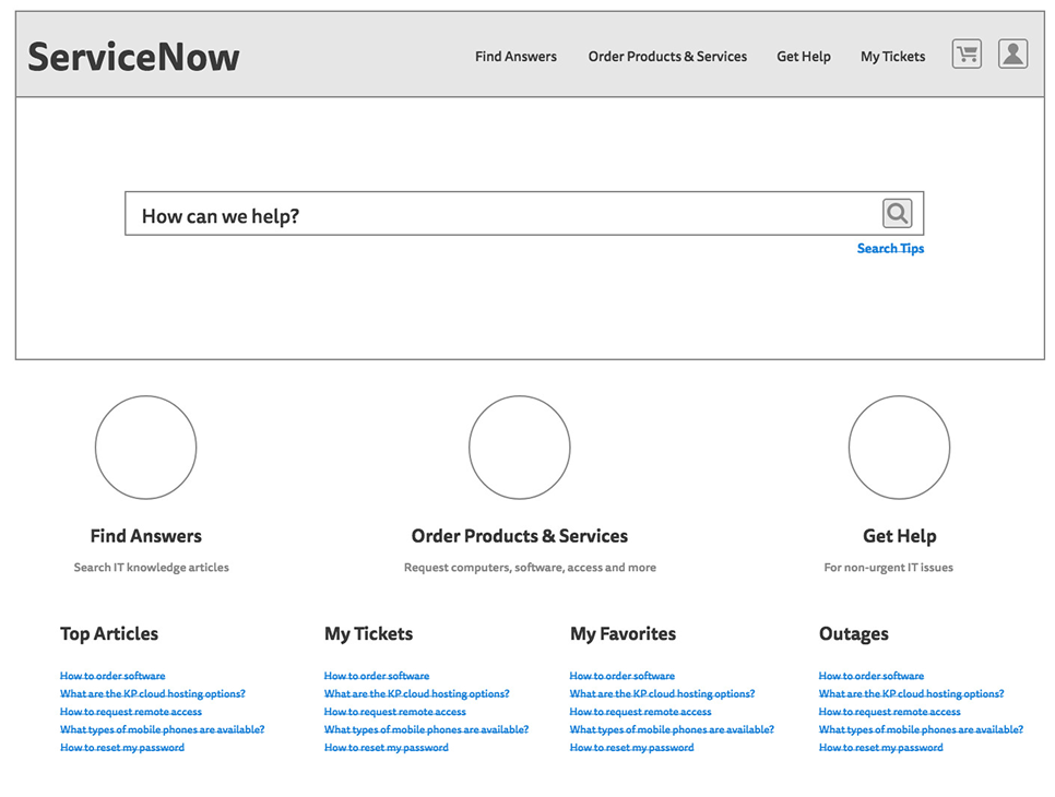
Desktop homepage wireframe
08Desktop information architecture
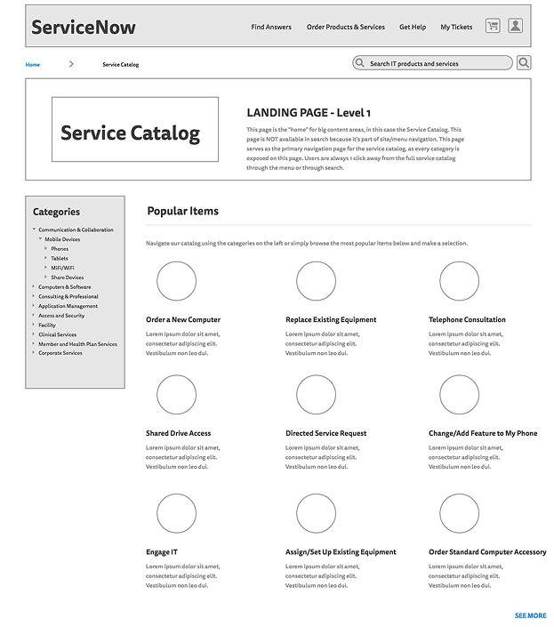
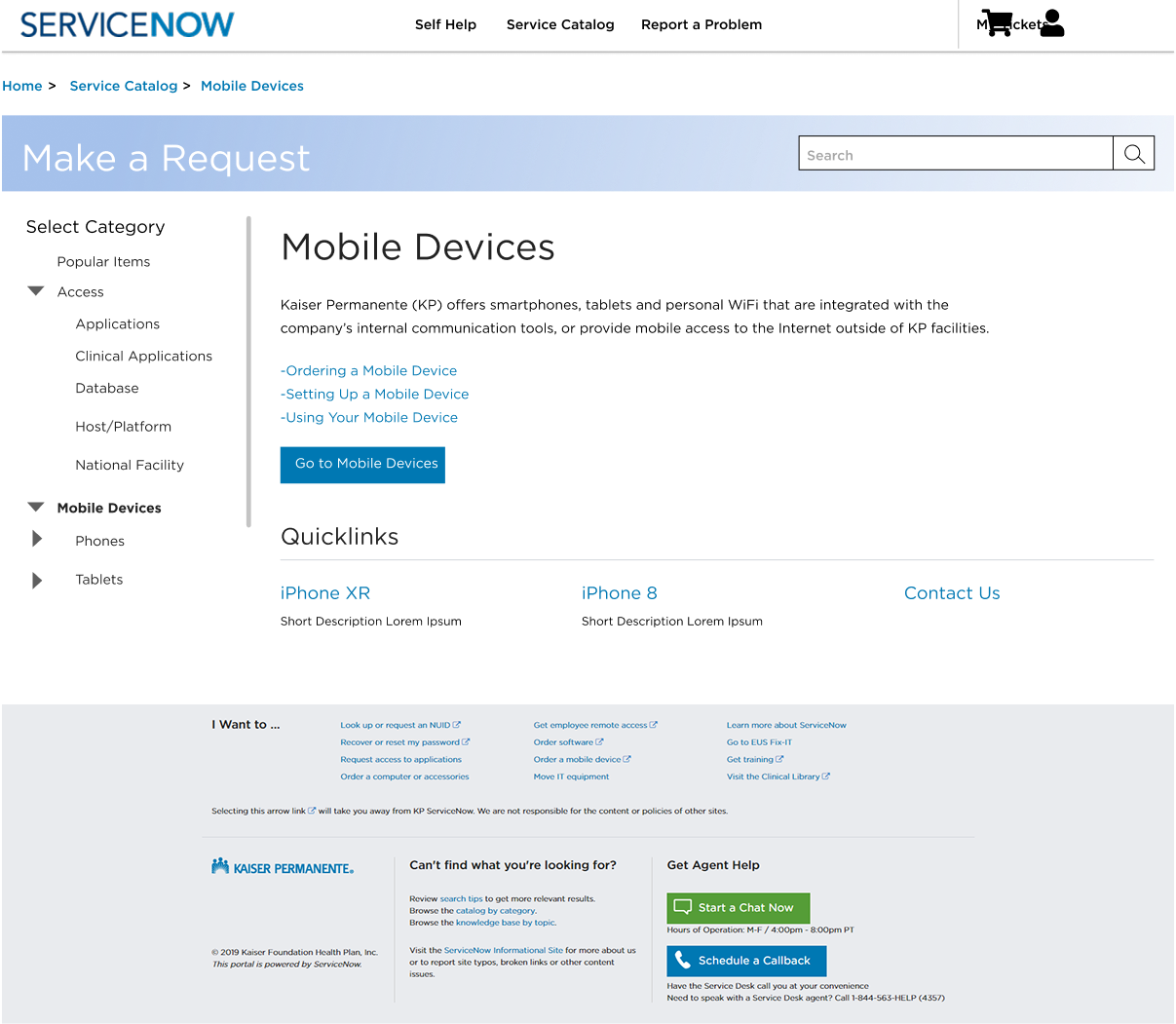
Service catalog wireframe
09Organizing a complex service catalog
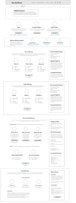
Mobile wireframe explorations
10Exploring responsive patterns
Final mobile wireframe
11The refined mobile direction
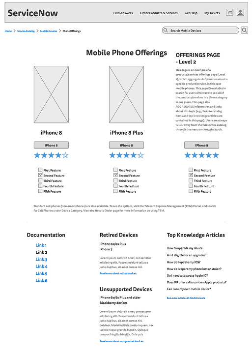
Low-fidelity phone layouts
12Testing hierarchy before visual polish
Low-fidelity mobile page
13A task-first mobile flow
High-fidelity mobile page
14High-fidelity responsive design
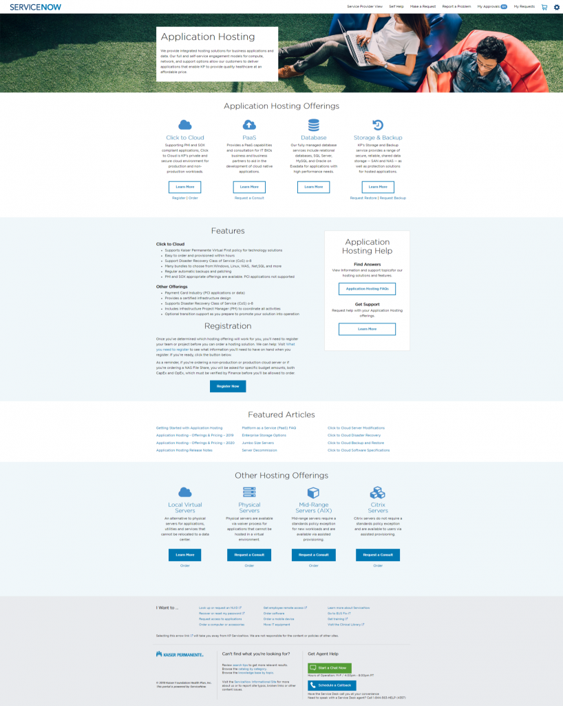
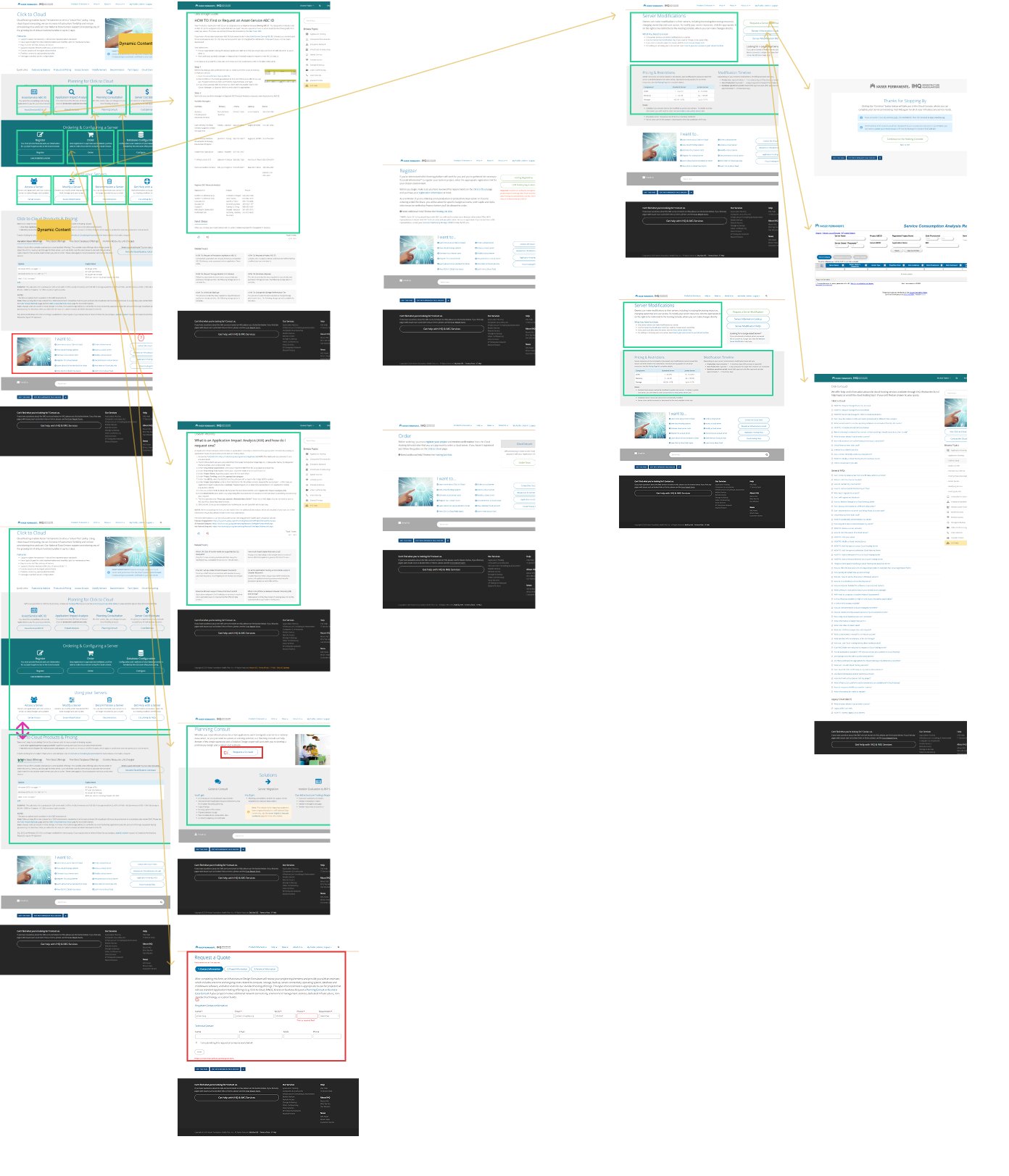
Application Hosting final page
15Final service page: Application Hosting
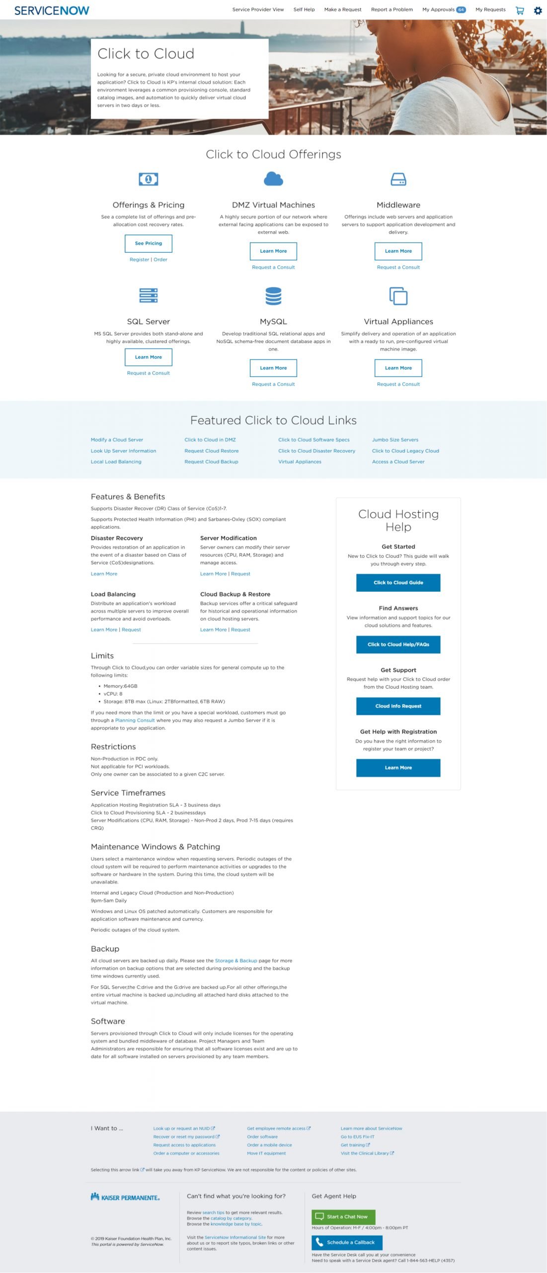
Click to Cloud final page
16Final service page: Click to Cloud
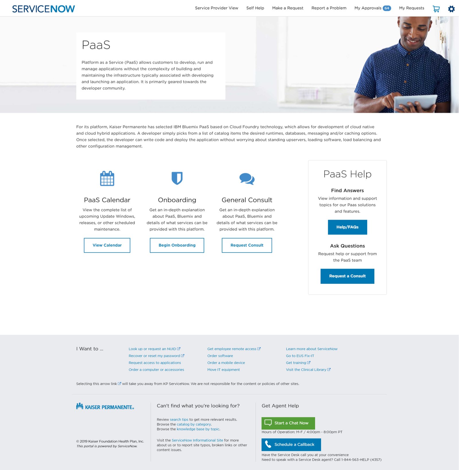
Platform as a Service page
17Platform as a Service content pattern
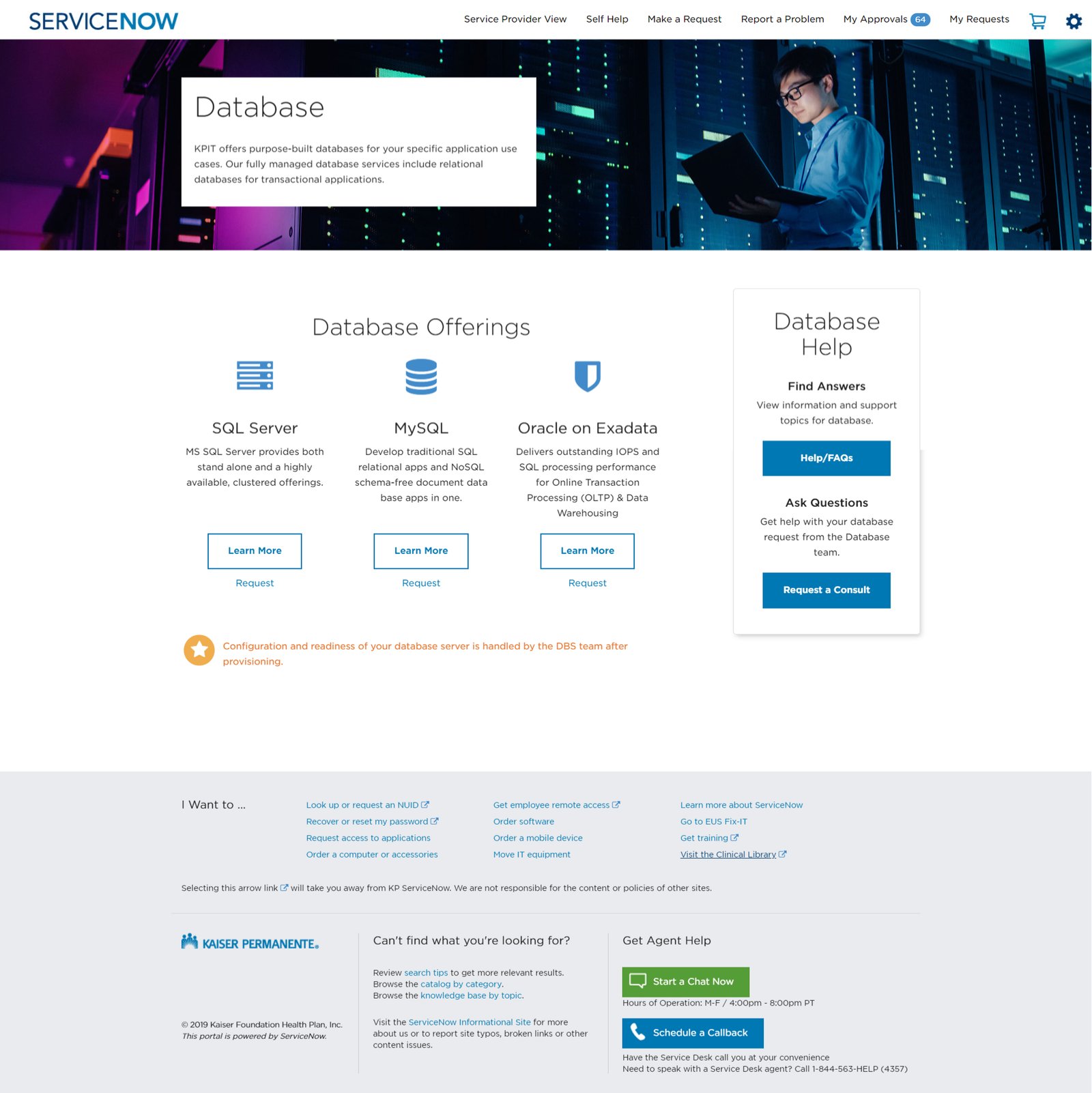
Database services page
18Database services content pattern
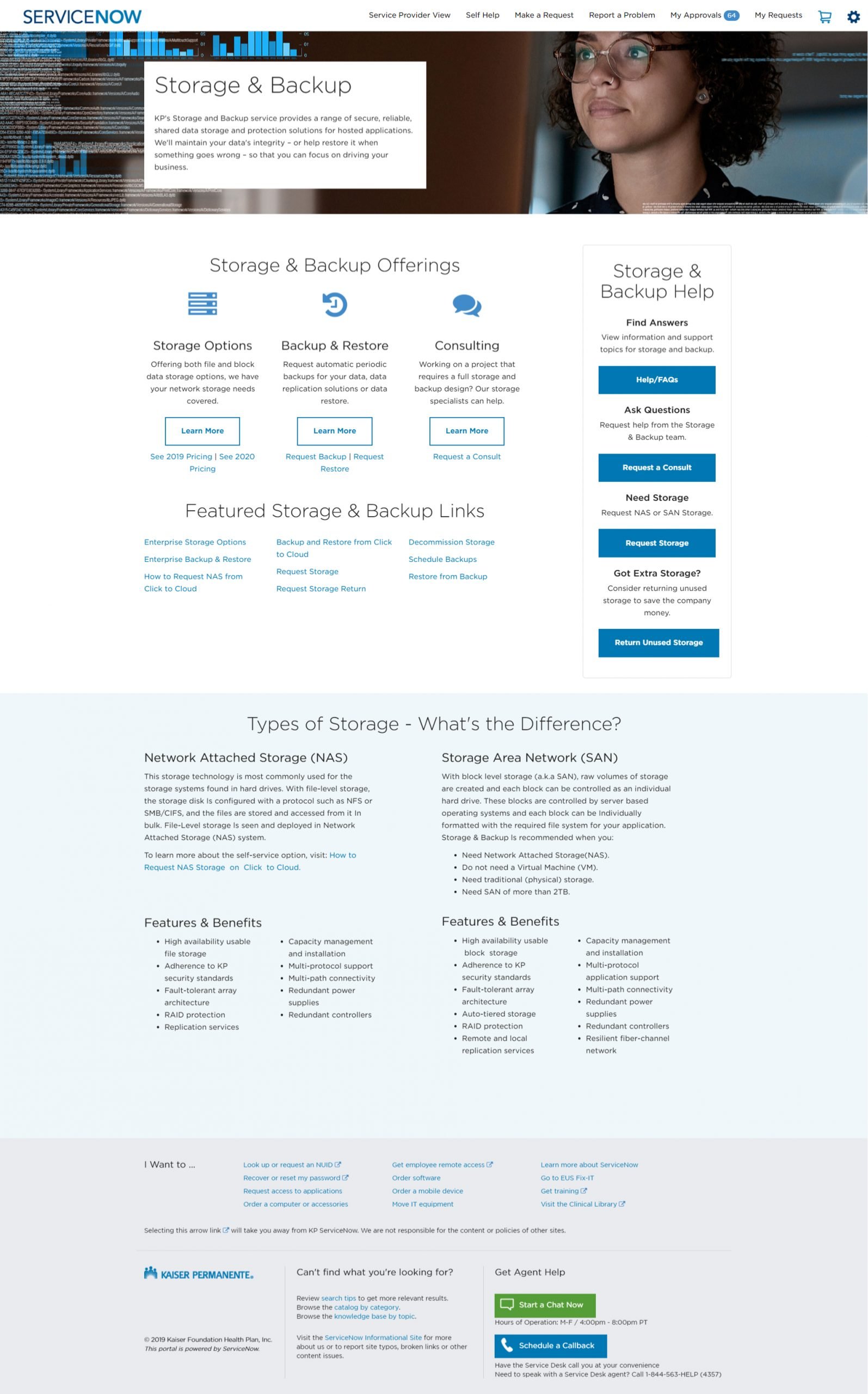
Storage and backup page
19Storage and backup content pattern
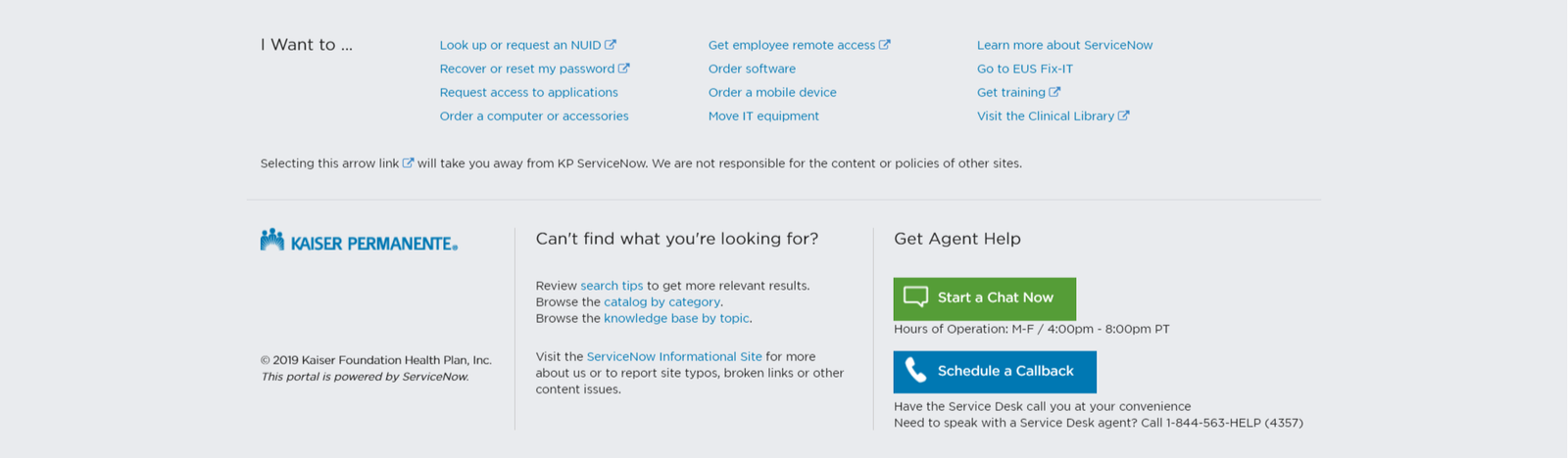
2019 portal footer
20The footer in 2019
2020 to 2022 portal footer
21The footer evolved with the platform
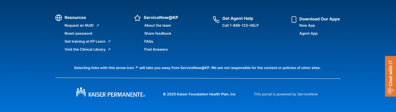
2022 to 2024 redesigned footer
22A more useful, structured footer
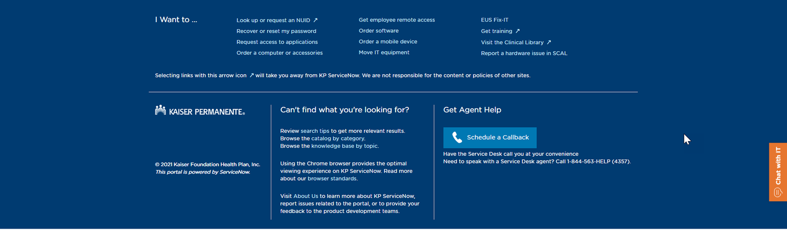
2024 to 2025 portal footer
23The latest footer system
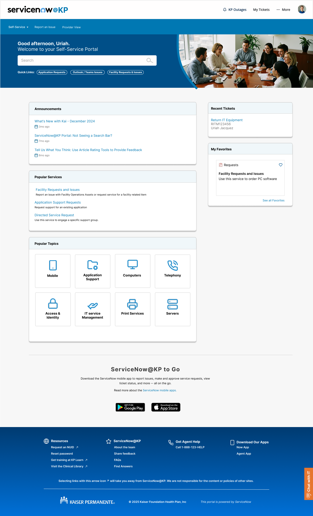
Final ServiceNow homepage
24The redesigned employee portal homepage
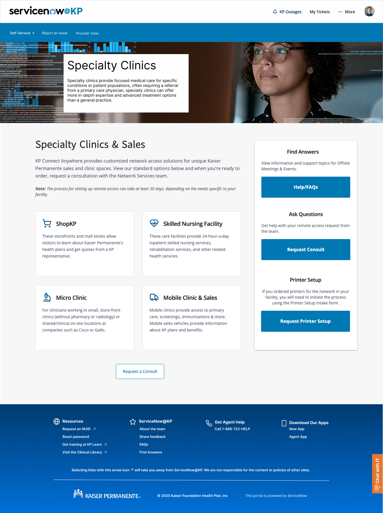
Service catalog feature page
25A scalable feature-page pattern
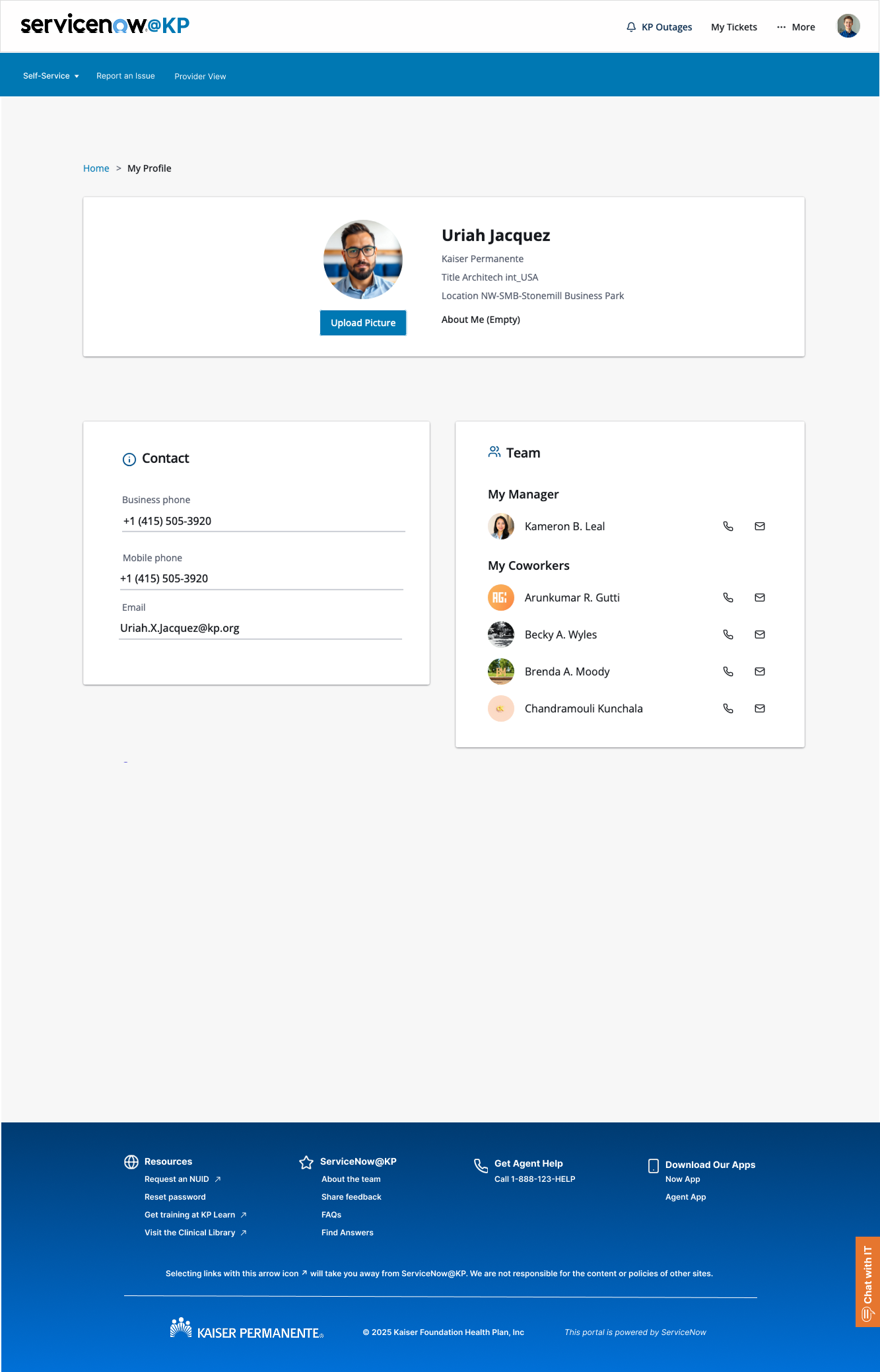
Employee user profile
26A clearer employee profile experience
Bicycling 404 illustration
27Human-centered error-state exploration
Meditation 404 illustration
28A calmer error-state concept
Alternate meditation 404 illustration
29An alternate accessible error state
Custom icon family
30A custom icon language for the portal
Expanded custom icon set
31Extending the icon system across services
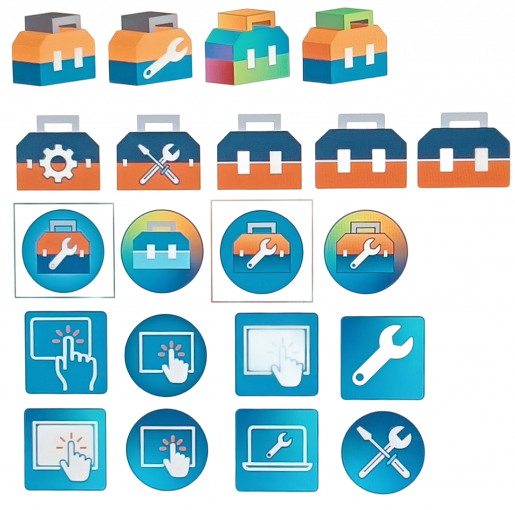
HelpNow icon revisions
32Iterating the support identity
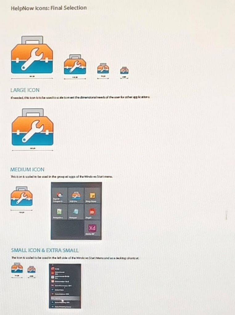
Final HelpNow icon
33The final HelpNow mark
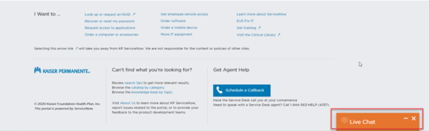
Chat placement studies
34Finding a discoverable, non-disruptive chat placement
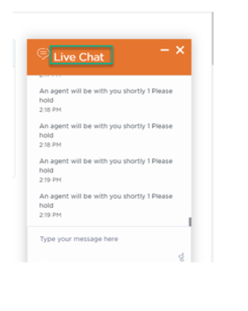
Chat title treatment
35Clarifying the assistant’s purpose
Chat bubble icon
36A compact branded launcher
Chat window controls
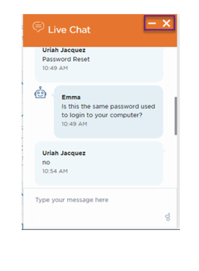
37Refining alignment and window controls
Assistant message style
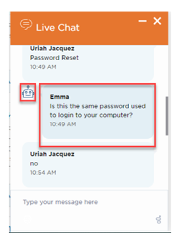
38Assistant-side conversation pattern
User message style
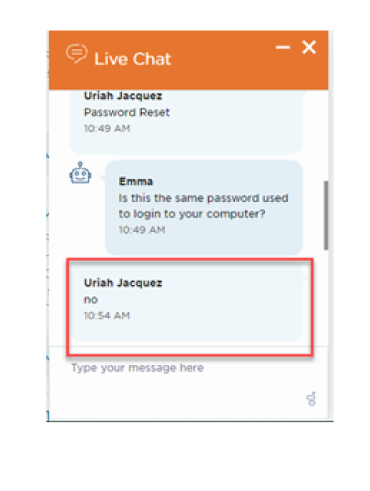
39User-side conversation pattern
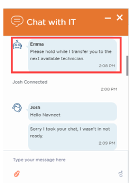
Live-agent transfer state
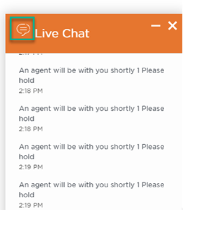
40Designing a clear handoff to human support
Next case studyFuture Star AI Agent